You have about five seconds. That is how long a visitor takes to decide whether they trust your website enough to stay, according to research from Google’s UX team. And every single one of those seconds is spent looking at one thing: your hero section.
If you have ever landed on a website and immediately felt either “yes, this is exactly what I need” or “nope, not for me” before scrolling at all, that reaction was the hero section doing its job — or failing at it. Understanding what a hero section is and how to design one that actually works is one of the highest-leverage things you can do for your website right now.
QUICK ANSWER
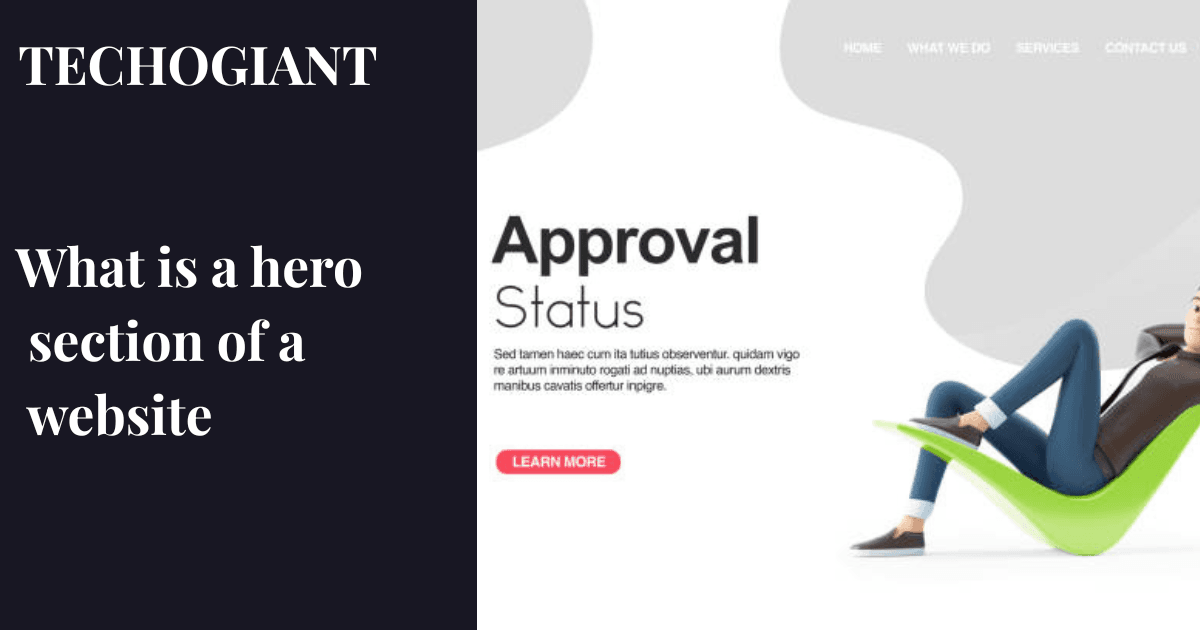
A hero section is the large, prominent area at the very top of a webpage, positioned above the fold so it appears before a visitor scrolls. It typically contains a headline, a short supporting description, a call to action button, and a visual element like an image or video. Its purpose is to immediately communicate who you are, what you offer, and what the visitor should do next.
Why the Hero Section Is the Most Important Part of Any Website
Picture this: a potential client lands on your website after clicking a Google ad. They have three other tabs open. Your homepage has two seconds, maybe three, to answer one silent question in their head — “Is this for me?” Your hero section is your only shot at answering that question before they leave.
Most website owners obsess over blog content, backlink building, and social media. Almost nobody gives their hero section the attention it deserves. That is a costly mistake, because no amount of traffic helps you if the first thing people see fails to hold them.
In my experience reviewing dozens of small business websites, the most common pattern is a vague headline like “Welcome to Our Website” sitting above a generic stock photo of people shaking hands. That layout costs real money every single day in lost conversions.
Your hero section is not decoration. It is a conversion tool, and it deserves to be treated like one.
Your hero section might be costing you clients right now
Let’s review your website and fix what’s turning visitors away.
A free 10-minute call is all it takes to identify what your hero section is missing and how to fix it fast.
Get My Free Hero Section Review →What Is a Hero Section on a Website?
A hero section is the full-width webpage element that sits at the very top of your page, directly below the navigation bar. It is the first thing anyone sees when they land on your site, and it occupies what designers call “above the fold” space — the visible screen area before any scrolling happens.
The term “hero” comes from print design, where a dominant image used to anchor a page layout was called a hero image. On the web, it evolved to mean the entire introductory section, not just the image.
What makes a hero section different from a regular banner?
A banner is passive. It displays information. A hero section is active — it is engineered to create an emotional visual response, communicate your value proposition instantly, and direct the visitor toward one clear action. A banner tells. A hero section sells.
Think of platforms like Uber’s homepage. The moment you land, you see a clean headline, a location input, and one button. Nothing else competes for your attention. That is intentional hero section design at its finest.
The Core Elements of a Strong Hero Section
Here is what most design guides miss: a great hero section is not about looking beautiful. It is about communicating clearly and reducing decision-making friction in the first few seconds. Beauty supports that goal. It does not replace it.
The benefit-oriented headline
Your headline is the single most important piece of text on your entire website. A benefit-oriented headline tells the visitor what they get, not what you do. “We Build WordPress Websites” is a feature statement. “Get a Website That Ranks on Google and Brings You Clients” is a benefit statement. One of those makes someone lean forward. The other makes them shrug.
The supporting subheading text
Your subheading adds context in one to two sentences. It answers the follow-up question the headline creates. If your headline says “Get a Website That Ranks on Google,” your subheading might say “We build fast, SEO-optimized websites for small businesses — ready to launch in two weeks.” Short, specific, reassuring.
The primary call to action
One button. Not three. Research from ConversionXL shows that pages with multiple calls to action convert at significantly lower rates than those with a single clear CTA. Visual contrast on the CTA button matters enormously — the button color should stand out against your background, not blend into it.
The visual element
This is your hero image, background video, or animated hero element. Visuals are processed approximately 60,000 times faster in the human brain than text. Your visual should reinforce your message, not distract from it. A SaaS product works best when showing the product in action. A service business works best showing a real person or real result.
Trust signals
Social proof elements placed in or directly below the hero section dramatically increase credibility. This includes brand logo displays from known clients, review count badges, or a short testimonial. Seeing a familiar Fortune 500 logo near your headline borrows that company’s authority and transfers a fraction of it to you.
| Element | Purpose | Priority |
|---|---|---|
| Benefit-first headline | Tells visitor what they gain immediately | Essential |
| Supporting subheading | Adds context and specificity to the headline | Essential |
| Primary CTA button | Directs visitor to one clear next action | Essential |
| Hero image or video | Creates emotional visual response instantly | Essential |
| Social proof logos | Builds trust through aspirational brand association | Recommended |
| Secondary CTA | Offers a softer action for undecided visitors | Optional |
| Live user signup metrics | Shows momentum and social proof in real time | Advanced |
How the Hero Section Impacts User Behavior and SEO
Here is something most design articles completely skip over: your hero section directly affects your search rankings. Not in the way keywords do, but in the way user signals do.
Google measures what happens after someone clicks your link from search results. If they land on your page and leave in under 10 seconds, that behavior tells Google your page did not satisfy their search intent. A weak hero section that fails to instantly communicate relevance drives people away fast, which increases your bounce rate and decreases your average session duration. Both are negative signals.
Core Web Vitals and hero section performance
Your hero section is almost always the Largest Contentful Paint element on your page — meaning Google measures how long it takes your hero image or headline to fully load. Slow loading here directly damages your Core Web Vitals score, which is now a real ranking factor. Hero image optimization through image compression and lazy loading images where appropriate is not optional anymore. It is technical SEO.
How whitespace usage affects scroll behavior
A crowded hero section overwhelms visitors and reduces scroll depth. Generous whitespace usage around your headline and CTA creates visual hierarchy, draws attention to what matters, and keeps the eye moving naturally downward. Heatmap tool data from Hotjar consistently shows that clean, spacious hero sections produce longer scroll depth and lower exit rates than cluttered ones.
Worth knowing: Your hero section’s Largest Contentful Paint score should ideally load in under 2.5 seconds. If your hero image is larger than 200KB uncompressed, you are almost certainly failing this benchmark and losing both rankings and visitors at the same time.
Best Practices for Designing an Effective Hero Section
After looking at hundreds of hero sections across industries, certain patterns show up consistently in the ones that convert well. These are not rules — they are observations from what actually works.
Lead with what the visitor gets, not who you are
New website owners almost always make this mistake. They put their company name or tagline as the headline. Your visitor does not care about your company name in the first three seconds. They care about whether you can solve their problem. Start with their outcome, then introduce yourself.
Use one CTA, not three.
Every additional button you add to your hero section splits your visitor’s attention. A single primary call to action with strong visual contrast on the CTA button converts at a higher rate than a layout with multiple competing options. If you must offer a secondary CTA, make it visually subordinate — smaller, outlined, less bold.
Match the visual to the emotion you want to create
Your hero image or background video carries emotional weight before a single word is read. A photography studio should feel warm, natural, and personal. A cybersecurity firm should feel precise, controlled, and authoritative. Mismatching your visual tone to your brand identity confuses visitors at a subconscious level and increases exit rates. Tools like Figma make it easy to prototype different visual directions before committing to one.
Test before you assume
A/B testing your hero section is one of the highest-return activities in conversion rate optimization. Even changing a single word in your headline can shift conversion rates by 10 to 30 percent. Platforms like Webflow and Prismic support structured slice models that make A/B testing hero section variations simple without needing a developer for every change. If you are not testing, you are guessing.
Not sure if your hero section is working?
I’ll tell you exactly what to fix in a free 10-minute website review.
No guesswork. No long reports. Just clear, actionable feedback on what your hero section needs to convert better.
Review My Website for Free → I Just Have a Quick QuestionTypes of Hero Sections and When to Use Each
Not every hero section looks the same, and it should not. The right type depends on your website’s goal, audience, and content. Here are the five most effective formats and the situations each one serves best.
Full-width image hero
This is the most common format. A single high-quality image spans the full width of the screen with your headline and CTA layered on top. It works best for service businesses, portfolios, and local businesses where visual impact matters more than product demonstration. The risk is that a slow or generic image kills the effect entirely.
Background video hero
A looping background video creates movement and atmosphere without requiring the visitor to take any action. It works brilliantly for hospitality, events, lifestyle brands, and creative agencies. The honest trade-off is page load time. A background video hero must be compressed aggressively and loaded after the critical text content renders, or your Core Web Vitals score suffers.
Product screenshot or demo hero
SaaS and software companies benefit enormously from showing their product in action directly in the hero section. Seeing the actual interface removes uncertainty and answers the implicit question “what does this thing actually look like?” Tools like eBay and Notion use this approach because it shortens the decision-making timeline for buyers who need to visualize the product before committing.
Animated hero element
Subtle micro-animations and animated hero elements add energy to otherwise static pages. A floating illustration, a typing animation in the headline, or a scrolling logo bar all qualify. The keyword is subtle. Animation that is too fast, too large, or too distracting actively reduces readability and conversion. Frameworks like React, Vue, and Next.js make implementing lightweight animations straightforward without sacrificing performance.
Minimalist text-only hero
Some of the highest converting hero sections use almost no visuals at all. A powerful headline, a single subheading, a CTA button, and nothing else. This approach works exceptionally well for personal brands, writers, consultants, and anyone whose reputation speaks louder than any image could. It also loads almost instantly, which is a performance advantage not worth ignoring.
Real Hero Section Examples That Convert
Rather than listing generic “inspirational” examples, let me point to specific patterns that demonstrate measurable design logic.
Uber’s homepage hero does one thing: it shows a location input and a single button. The headline is three words. This works because Uber’s goal is task completion, not brand education. Every design decision removes friction from the single action they want you to take.
Notion uses a product screenshot hero combined with a short benefit headline and social proof in the form of a user count. Seeing “used by over 30 million people” next to the product screenshot answers two questions at once — what does it do, and can I trust it? That combination is a textbook social proof element placement done right.
Headless CMS platforms like Prismic and Storyblok use a structured slice model in their hero sections, showing developers the actual code alongside a visual output. This technique speaks directly to a technical audience and builds instant credibility through demonstrated product clarity rather than marketing language.
Common Hero Section Mistakes to Avoid
Most of these mistakes are invisible to the people making them, which is exactly what makes them so expensive.
Writing a headline that describes you instead of helping them
“Pakistan’s Leading Digital Agency” tells the visitor nothing about what changes in their life after working with you. “Get a Website That Ranks on Google and Brings You Clients” tells them everything. Always lead with the visitor’s outcome.
Using an uncompressed hero image
A hero image above 500KB with no compression is one of the most common technical SEO errors on small business websites. Use image compression tools, convert to WebP format where supported, and always check your Lighthouse performance score after adding or replacing your hero image. A beautiful image that loads in four seconds does more damage than a mediocre one that loads in under one.
Putting too much text above the fold
A hero section is not your About page. It should not contain your full service list, your founding story, and three testimonials. Each element you add above the fold competes for attention and weakens everything else. Your one job in the hero section is to make the visitor want to scroll.
Ignoring mobile-first design
Over 60 percent of web traffic comes from mobile devices. A hero section designed beautifully on a desktop that renders as a wall of tiny overlapping text on a phone screen is not a design — it is a liability. Always preview your hero section on a mobile screen before publishing, and treat the mobile layout as the primary layout, not an afterthought.
Making any of these mistakes right now?
Let’s fix your hero section before it costs you another potential client.
Book a free 10-minute call and walk away with a clear, specific plan to make your hero section work harder for your business.
Fix My Hero Section — Free Call →Final Takeaway
Your hero section is what is a hero section on a website made real in practice — it is the first conversation your website has with every visitor, and that conversation happens in about five seconds. Get it right, and visitors stay, scroll, and take action. Get it wrong, and all your SEO effort, ad spend, and hard work sends people straight to your competitor’s site instead.
Start with a benefit-oriented headline that speaks directly to your visitor’s outcome. Add a supporting subheading that gives them one specific reason to trust you. Place one high-contrast CTA button. Use an optimized visual that reinforces your message. And test it — because the version you think is best is rarely the version that actually converts the most.
If your hero section is not clearly communicating who you help and why they should care, that is the most valuable thing you can fix on your website today. Start there.
What is the purpose of a hero section on a website?
The hero section’s purpose is to answer one question for every visitor the moment they land: “Is this what I was looking for?” It communicates your value proposition, establishes visual brand identity, and directs the visitor toward a single clear action — all before they scroll. It is essentially your website’s first and most important sales moment.
What should a hero section include?
At minimum, a strong hero section needs a benefit-oriented headline, a supporting subheading that adds context, a primary call to action button, and a visual element such as an image or video. Social proof elements like client logos or a user count are highly recommended additions that significantly improve trust and conversion rate.
How big should a hero section be?
A hero section should occupy 100% of the viewport height on desktop, meaning it fills the visible screen before scrolling. On mobile devices, this typically means around 500 to 700 pixels in height, depending on the device. The goal is that your headline, subheading, and CTA are all fully visible without any scrolling required on the most common screen sizes.
Can a hero section include video or animation?
Yes, and when done correctly, both video and animation significantly increase engagement time. A background video hero works especially well for lifestyle, hospitality, and creative brands. Animated hero elements like subtle floating graphics or micro-animations add energy without requiring visitor interaction. The critical rule is that all video and animation must be optimized for fast loading — unoptimized video in a hero section damages your Core Web Vitals score and page load time directly.
How does the hero section affect SEO?
The hero section affects SEO primarily through two channels. First, it determines whether visitors stay or leave immediately, which directly influences your bounce rate and session duration — both signals Google monitors. Second, the hero image is almost always your page’s Largest Contentful Paint element, meaning its load speed directly affects your Core Web Vitals score, which is a confirmed Google ranking factor.
Should every page on a website have a hero section?
Not necessarily. Hero sections are most valuable and most commonly used on homepages, landing pages, and key service or product pages. Blog posts, legal pages, and checkout flows rarely benefit from a traditional hero section. The question to ask is: does this page need to immediately establish context and direct user behavior, or does it serve a functional purpose where visitors already know why they are there?